
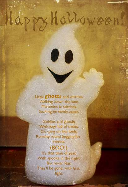
Happy Halloween everyone!
First I'd like to thank Kim for letting me share my little Halloween how-to ghosty with you all. I've been a loyal reader here since the beginning and it has truly been a place and source of inspiration for me!
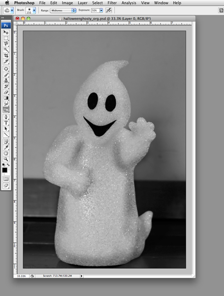
I was watching a tutorial on Photoshop displacement maps the other day as I was putting up our Halloween decorations -- yes, that's right -- if I didn't multi-task, I'd be toast!. As I was setting up our little glowing ghosty it occurred to me that he would be the perfect model to practice using what I had just learned about.
You may be asking, just what is a displacement map? Think of it as a contour map -- you know those maps with all the circles on them that show differing elevations of a section of land?Photoshop takes your photo and analyses the contrast to create a similar contour map -- which you can then use to create a fun dimensional effect over your image. It our case, I'm using a cute Halloween poem by Juan Olivarez and making it fit the contours of the ghost.
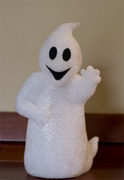
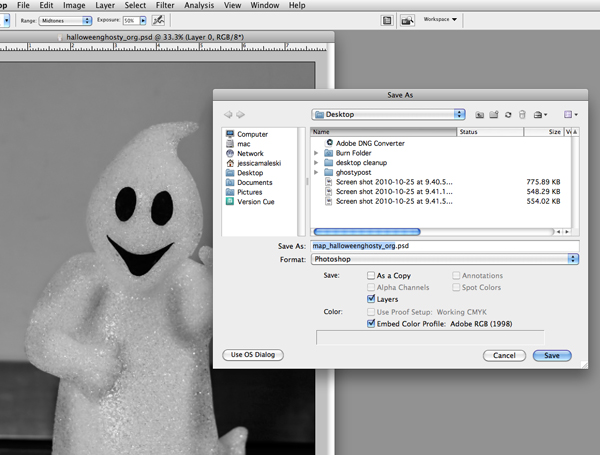
The first thing you need to do is create a black and white image of your original file.
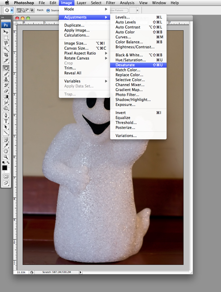
Photoshop is using the contrast between the light and dark pixels in order to do the calculations that will make the map -- the more contrast the more movement there will be in the map and ultimately in the text. Once you have desaturated the image you need to boost the contrast -- you can use a levels or curve adjustment (or any contrast boosting action that you like). It also helps to use the burn tool to create a little more local contrast in the areas where you really want the text to warp.
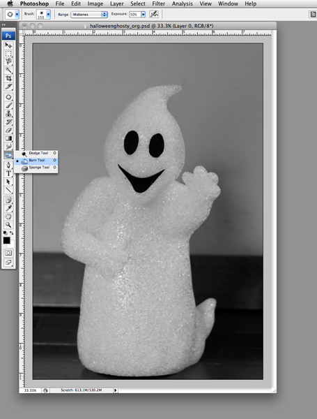
I wanted to see some movement along the arms and around the edges of the ghost so I burned along those creases.
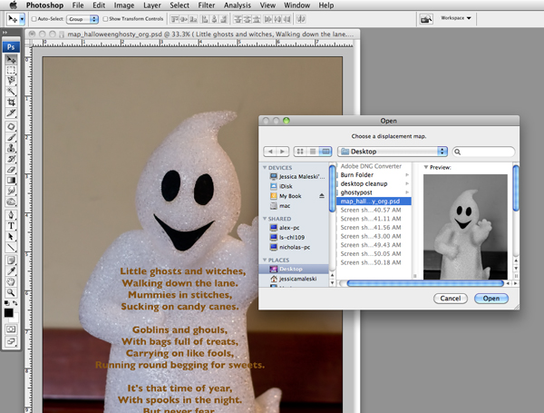
Finally, save the black and white image as a photoshop file -- if you use "map" in the title it will be easier to find when you open it back up in a few minutes!
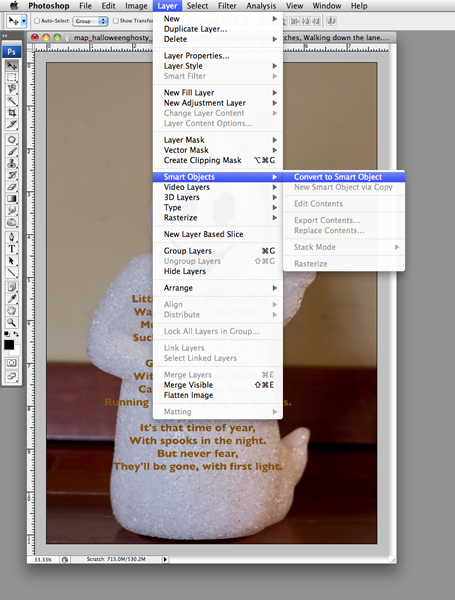
Next you want to copy the text of the poem and paste it into a text layer. It is very important to convert that text to a smart object -- that allows you to use filters on the text but still be able to go back and edit any changes you may want to make to the text. Sometimes after the text has been displaced you may wish to tweak it for a better effect. Smart filters allow you to be able to do that without have to go back in time with the history tab and re-do things. It makes life easier -- and that's always a good thing!
Finally, on that same text layer open up the displace filter.
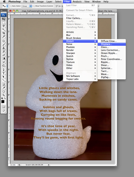
Leave it at the default settings -- since it is set up as a smart object you can easily go back and play with the settings to change the effect.
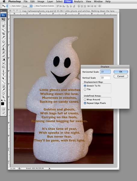
Select the "map" file that we just saved.
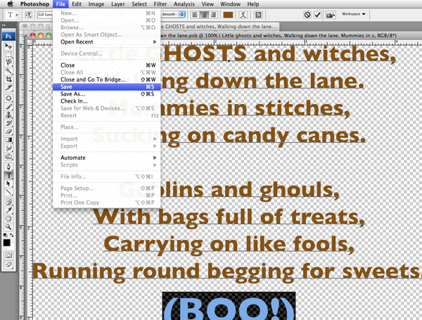
And there you have it! The text is now warped around the little ghosts body. If you would like to alter the text, click on the layer thumbnail and follow the directions.

Then you can alter the text for readability and design -- just be sure to save and then when you flip back to the image, the text will have changed.
That's the bulk of the work on this image. The rest of the look comes from three different texture layers, several different layers of brushes (colors of the brushes were sampled from the background after I had built up the texture layers) - some text, some leaves, some torn edges -- all set to various blending modes and opacity. I usually masked off the brushes and textures from the ghost because I wanted the text to be readable and I wanted him to stay somewhat clean and white (like a good little ghost!). I used Spider Bites font for the Happy Halloween. And finally, I used a warm color fill layer to bring it all together and give it a nice, warm cast.
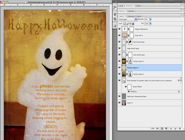
I think this would work equally well with big orange pumpkins or those beautiful green and white pumpkins that are at the markets right now. A bumpy and crumbly autumn left? The trunk of a birch tree? So many possibilities!
.....
Jessica Maleski is a mother of six who lives and drives in Northern Virginia. She has been playing with photoshop for longer than she cares to admit and likes to play photographer when she isn't doing laundry or driving kids around. You can catch at her blog: Living in a Still Life or on flicker: jdmaleski.
5 comments:
wow! so cool...thanks for the lesson!
Your welcome! It was my pleasure! : )
I am really new at any sort of editing, so this will be fun to try. Thank you so much.
yes, indeed ~ thanks for sharing your steps!
love the rich reds and mustard tones you achieved ... : )
happy halloween!
prairiegirl
Jessica
wonderful info and so perfect presented.
thank you for sharing it with the istudio group...
brilliant!!
xxo, kim
Post a Comment